Friday, 25 March 2016
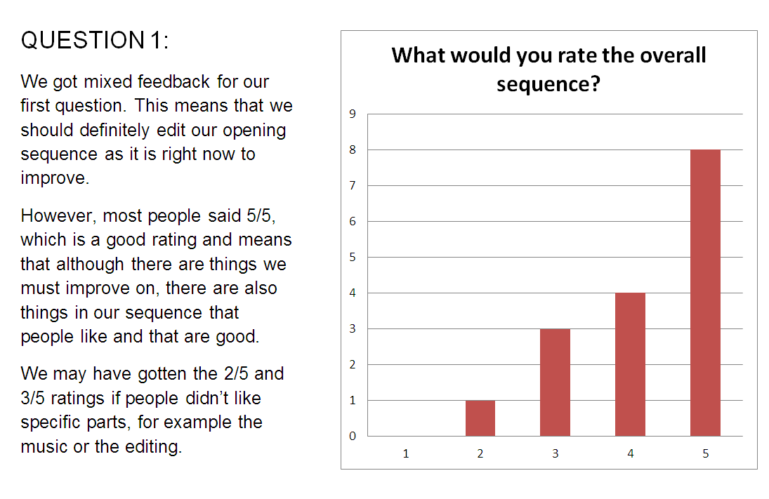


The Filled Out Questionnaires - Audience Feedback on Opening Sequence


Thursday, 24 March 2016
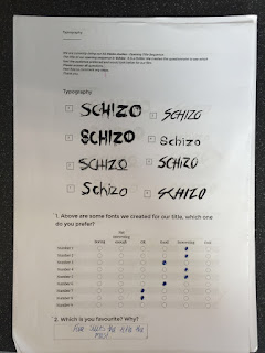
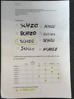
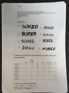
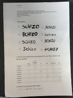
Analysis of Questionnaire - Font of Film Name
Here is my analysis on the feedback we got on our questionnaire about the font of our film name:


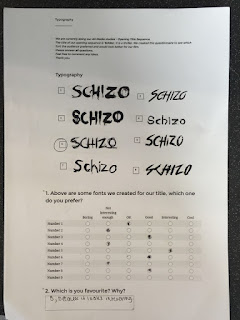
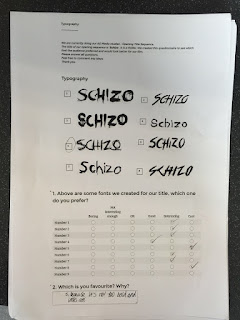
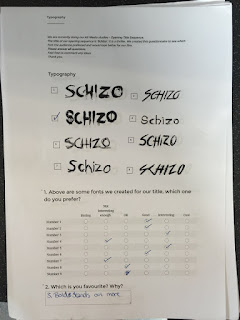
The Filled Out Questionnaires - Font of Film Name
We were undecided on a few fonts for the title of our opening sequence. We asked 16 media students of different genders and ethnicity's, who were all the ages of 16-18 to fill out a questionnaire to help us decide which font suited our opening sequence the most.
Disclaimer - we accidentally added a ninth option to tick, however it is discarded because we did not add one to choose.


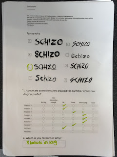
Disclaimer - we accidentally added a ninth option to tick, however it is discarded because we did not add one to choose.
Here are the filled out questionnaires:


Mapping of Our Opening Sequence

In the first cut of the sequence, we used fake names, but we ended up changing the names to our actual names. All together there are 14 titles, which is not a heavy amount like a Hollywood film would be, but it is enough to be effective.
Monday, 14 March 2016
Final Animated Production Company Logos
Here are our final animated production company logos that we have created using Serif DrawPlus X6. Some of them are a bit blurry and not very clear, however we still think they are still usable and we will ad some sound effects to them when we add them to our final piece so that they are more effective.
Friday, 11 March 2016
Logo For Production Company
We have taken our initial sketches of our production company logo and have turned them into our final production company logo using the program 'Serif Draw Plus X6'.

These are our options for our production company logo, however we have changed them from sketches into suitable logos so that we could accurately decide which one we like out of them all.

After seeing how the designs looked, we decided upon this design, as it is simple, yet effective. We have then animated the logo so that we can include it into the beginning of our opening sequence.
Sunday, 6 March 2016
Lighting, Editing and Sound - Research
Lighting:
- HIGH KEY - The lighting is bright and may include mixed white colours. We won't be using this lighting because we can't to create a somewhat unsettling atmosphere for the audience.
- LOW KEY - This lighting is dark and may include shadows and dark tones. We might be using this lighting because it will create a dark vibe, but we don't want our sequence to come off as a horror so we might opt for something else.
- COLOUR FX - Different colour combinations depending on the atmosphere of the film. Examples are black and white or sepia, as well as blueish effects or warm yellow effects. We might use this lighting as opposed to the low key lighting. This is because we can make the sequence dark and creepy but not too scary so it can be seen as a thriller and cause suspense.
In this video I have used an effect from iMovie called 'Day to Night', which includes bluish but dark tones and makes the lighting low key.
EDITING:
- CONTINUITY EDITING - Film sequences normally follow this type of editing in order to make them flow and transition in a believable way. Only cuts will be used in order to make scenes more realistic.'Cross-cutting' may also be included, which is when two different pieces of action are shown at the same time during a sequence, but it still maintains a flow to make it have a 'real life' affect. This is the main common editing style in film, so we will be using it in our opening sequence, however we may add some fades in and out of the sequence to create more variation.
- MONTAGE EDITING - The opposite of continuity editing, whereby the cuts in the sequence are noticeable and don't have a flow of time.
- CUT - An image is instantly replaced by another without a noticeable transition. We will be using this because it is used in continuity editing.
- CROSS/DISSOLVE - One image dissolves into another.
- FADE UP - An image fades in from black. We will be using this to transition from the quote to the start of the scene.
- FADE OUT - An image fading out to black. We may use this after the title of the film is shown.
- WIPE - One image replaces another and the border between the image will move across the screen.
SOUND:
- DIEGETIC SOUND - Sound that is involved and is part of the film world e.g. cars or birds. We will be using this for our phone sound effects.
- NON-DIEGETIC SOUND - Sound that is not part of the film world and is not part of what is happening on screen e.g. a soundtrack. We will be using a soundtrack in our opening sequence.
- SOUND BRIDGE - Linking two scenes together through sound. We may use this in our task.
- SOUND EFFECTS - Sound which is added on which is not dialogue or music. Sound is added during post-production e.g. our phone ringing sound effects.
Friday, 4 March 2016
Logo for Production Companies Planning


Here are drawings of our initial ideas for what we would like our production logos to look like. We will choose three of these for our final production and animate them to make them more attractive.
Analysis of Non-diegetic Soundtrack Music
This is the non-diegetic, asynchronous soundtrack that we chose to use for our final opening sequence. I have gone through the section of the soundtrack that we will be using and I have gone through it describing why we are using it any why it suits our opening sequence perfectly. Whilst editing the opening sequence when it is completed, I will add sound effects to it, such as sounds for the production logos, the phone ringing, and various other sound effects.
Here is my analysis of the piece:
Here is my analysis of the piece:
Here is the piece of music by itself:
Subscribe to:
Comments (Atom)